Sometimes it’s interesting and useful to review how a design has evolved, to ensure that it’s still fit for purpose.
As a registered charity BHT provides a wide range of services tackling complex needs around housing, legal representation, mental health and recovery from addiction as well as work and learning initiaives. A map of services that aimed to communicate where they crossed over encouraged collaboration and skill sharing, as well as presenting staff with a handy overview of the organisation.
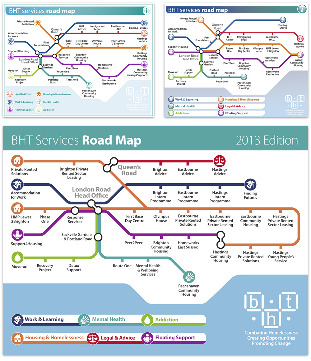
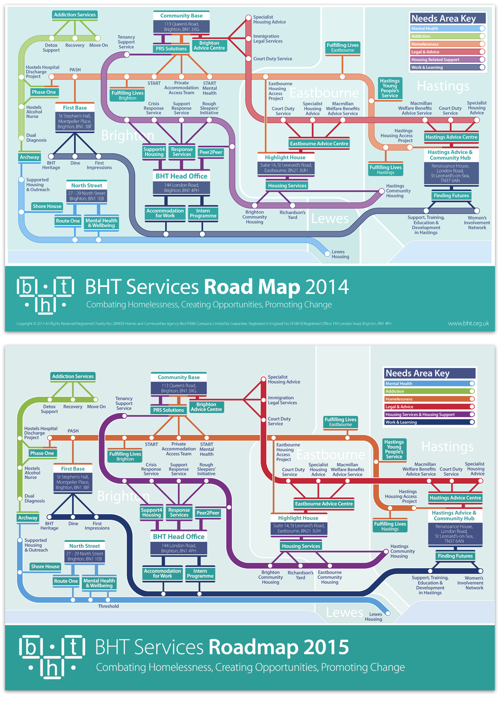
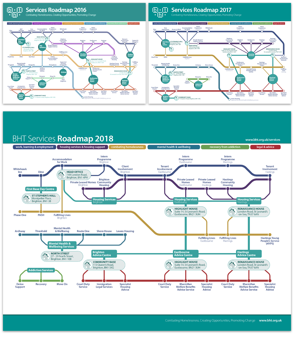
As projects opened and closed over the years the function of the roadmap had to change accordingly. Placing a greater emphasis on the physical location of projects became necessary as the audience widened to clients, tenants and other stakeholders.
The design style also evolved as the charity’s branding exercise matured. Earlier work is more skeuomorphic, evolving to a simpler, flatter, more material design style, more in tune with the rest of the brand.
Anthony is an extremely talented and creative designer, with a great ability to work to a brief and meet the needs of his clients.


