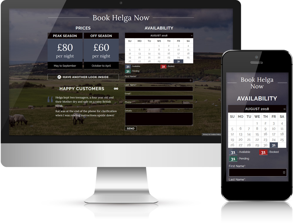
The Camp Adventure Travel website is an example of the design maxim, ‘less is more’.
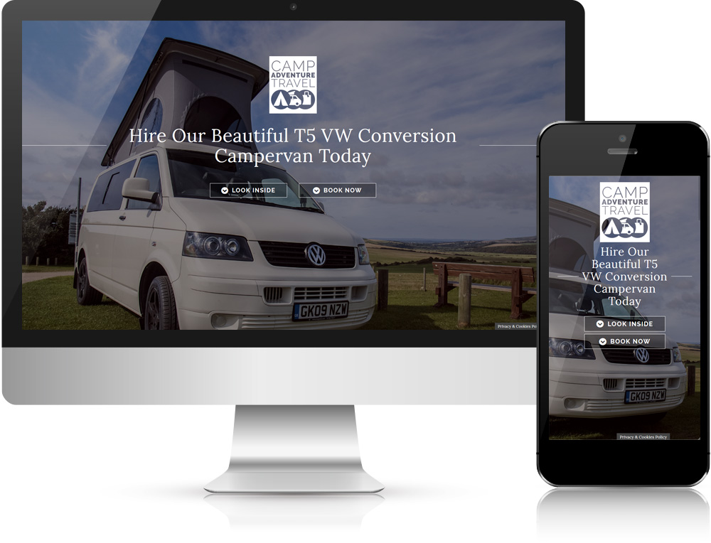
The client requested a website with a store front and full shopping cart functionality. As she initially only had a single product to sell I advised that it would be more cost-effective to create a single page site with a simple calendar and manual booking. This could then be extended in the future if necessary.
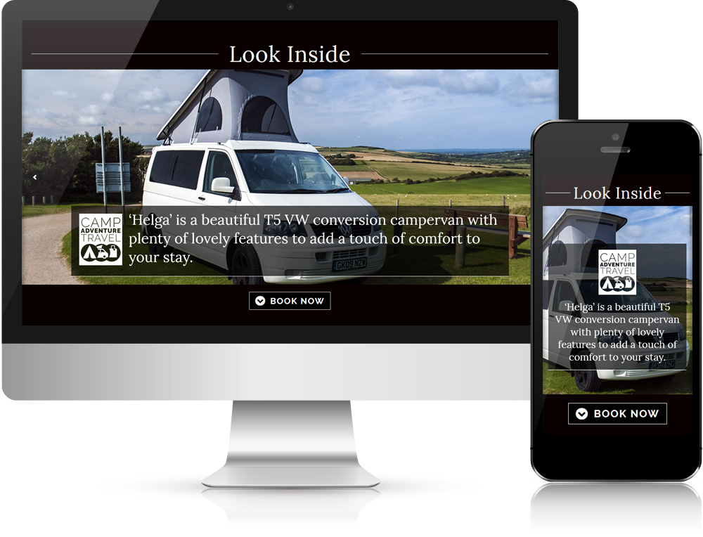
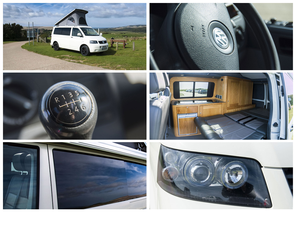
I provided website design and build, logo design and photography for the site. Photography throughout the site supports themes of freedom and practicality that holidaying in a camper van evokes, and a slideshow allows the potential customer a tour of the product before commiting a booking.
The site and branding were turned around in less than two weeks, and I also provide hosting and server administration. The website is fully responsive, allowing customers to book through various devices with ease.
Anthony was always there to help out, never seeming to mind my many questions. He used his considerably creative skills to do all the photography for my site and this elevated the standard even more. I tell everyone I know to go and see Anthony for their website needs. He works hard, has integrity and gets invested with his client's dreams; his kind and friendly manner made the whole experience a breeze!
