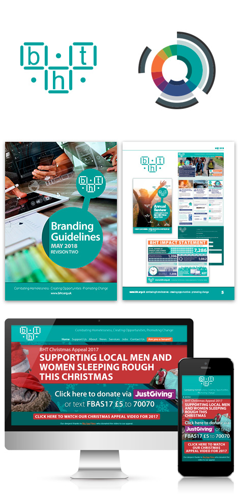
As Creative Director at BHT I was responsible for creating a strong, consistent brand which reflected the organisation’s values: combating homelessness, creating opportunities and promoting change.
BHT undertakes important work in tackling homelessness and dealing with complex issues. Creating a strong brand enabled BHT to stand out in a densely crowded, competitive and ever-shrinking third sector marketplace.
The resulting brand identity aimed to become intrinsic to the organisation’s culture, promoting a central, unifying idea around which all behaviour, actions and communications are aligned. I was allowed a relatively large amount of freedom to evolve the brand over time; the only element that had to be left alone was the logo, so I based designs around its various elements.
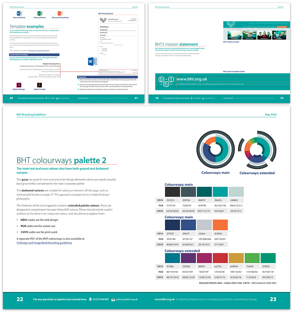
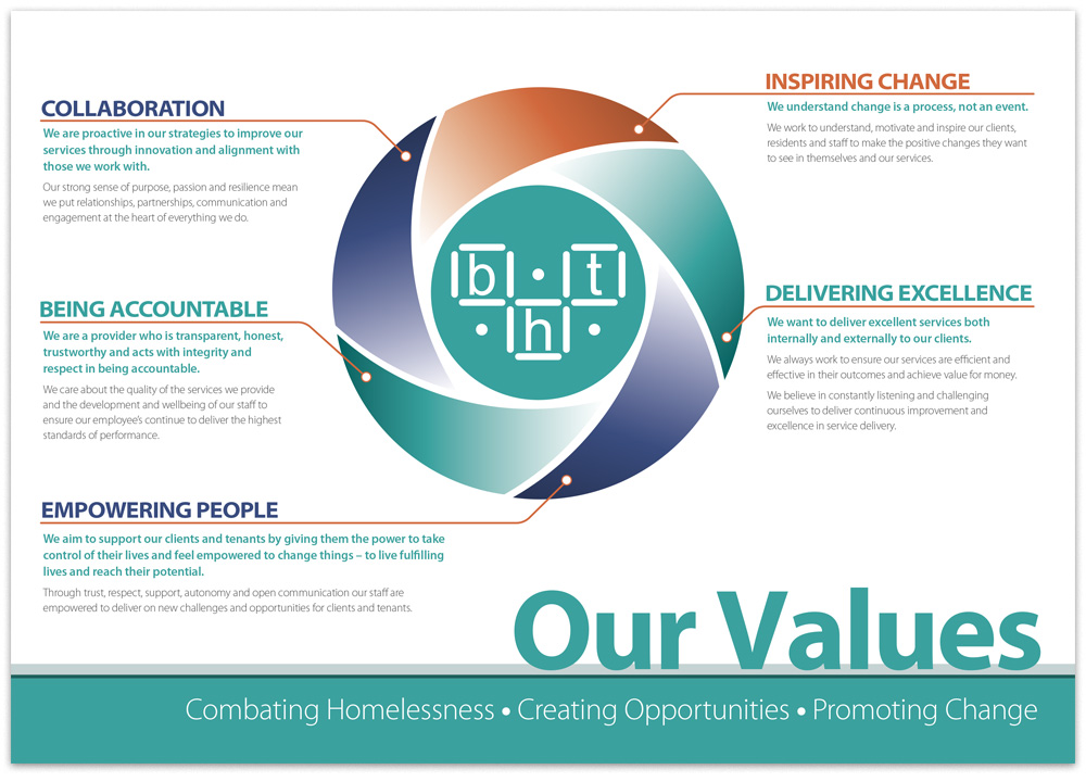
I provided a new website design and build, content management and server administration, templates for PowerPoint, Word and Excel, various reports both printed and digital, editorial work, signage, photography, leaflets and posters. An intrinsic part of BHT’s marketing strategy also involved digital communications including email newsletters and promotion of fundraising campaigns through various social media platforms.
Producing a comprehensive set of branding guidelines enabled me to promote the advantages of branding quality and consistency when visiting projects. Nobody develops a strong and meaningful brand strategy alone, and with strong buy-in from the top of the organisation together with the vision of key staff members the rebrand had a positive impact, helping win important funding bids and attract employees.
Anthony is a talented designer and web developer, with excellent attention to detail and creative flair.
He took care of all our digital and print needs, including service literature, annual reports and newsletters, as well as developing and maintaining our charity website, producing our fundraising campaigns and associated marketing materials.