Commissioning my services needn’t be complicated, time-consuming or expensive. Sometimes all a business needs is an eye-catching logo.
In my twenty-odd years of experience as a designer and artworker I’ve designed logos for numerous businesses of all sizes. Below is a good selection of these.
Anthony's done a great job for us on a number of different client projects over the past few years. His simple, modern approach to presenting complex analytics to a broad audience attracted him as a design partner for Fugu. We've valued his open and honest approach and his reliability and flexibility - either from our brief or directly with the client.
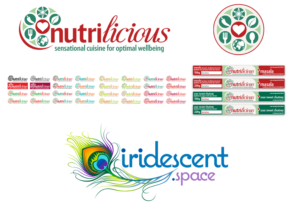
From top: Nutrilicious provides catering and workshops for aspiring chefs; for the logo colour was an important factor in evoking appetite, flavour and the joy of cuisine. iridescent.space was a logo and commission for a metaphysical website and blog, with the peacock feather symbolising a scribe's communication with their higher power.
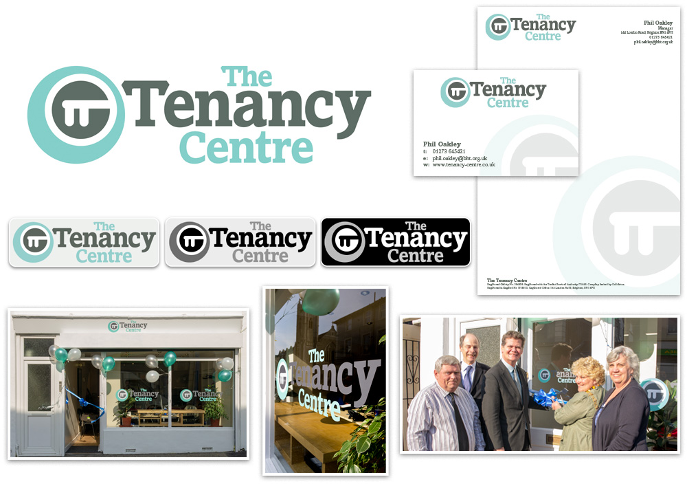
The Tenancy Centre was a social enterprise housing service based in Eastbourne. I designed the logo, business cards and letterheads, as well as their shop frontage.
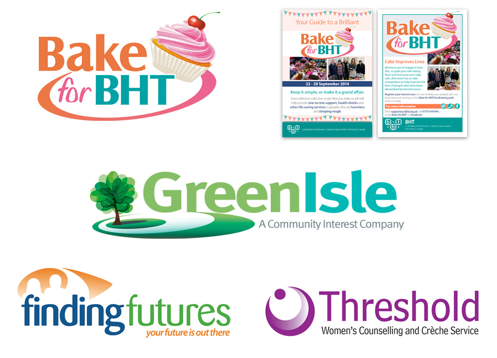
From top, clockwise: Bake for BHT was an initiative that provided support for people to fundraise for BHT through cake sales and coffee mornings; the GreenIsle logo was designed for a funding bid for a community interest company providing forestry training to disadvantaged children; Threshold is a women's counselling and creche service run by BHT; Finding Futures was an adult education project based in Hastings.
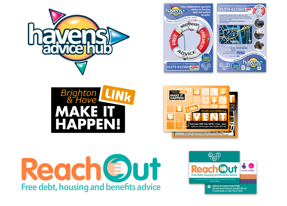
From top: The Havens Advice Hub logo had to appeal to a younger audience; the Brighton & Hove LINk logo was a rework from another design. The organisation had mislaid the original artwork for their logo so I recreated it in a vector format; the ReachOut logo had to communicate the duality of listening and supporting.
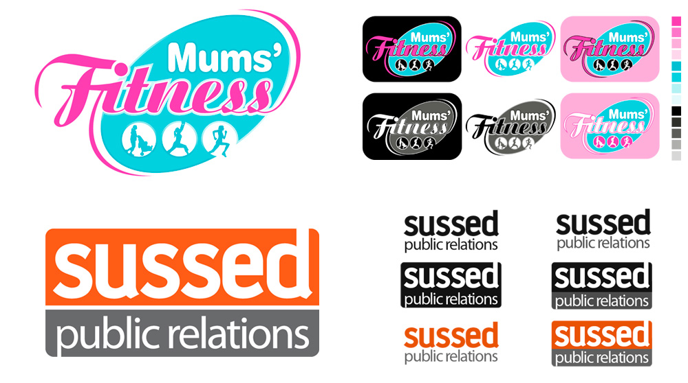
From top: For the Mums' Fitness brand I designed a set of logos and a car transfer; the Sussed PR logo needed to be vibrant yet serious and impactful.
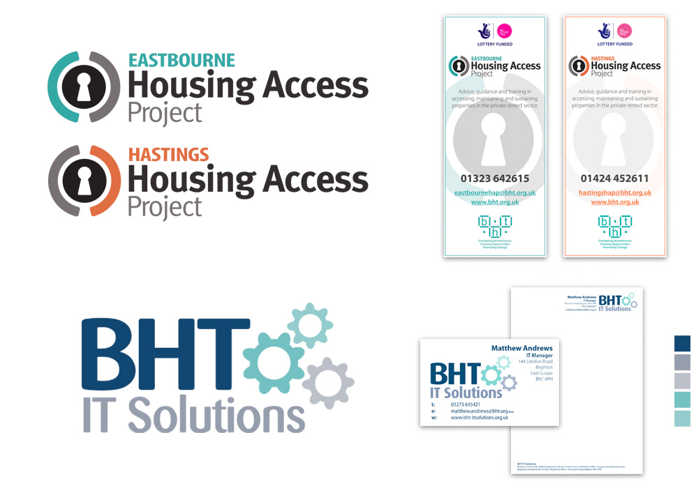
From top: The Housing Access Project logos were a literal interpretation of the scope and meaning behind the project; BHT IT Solutions was a sister social enterprise to my own BHT Design social enterprise. I designed a website, logo, business cards and letterheads and well as providing photography.